En 4500 millones de años no ha habido correlación entre CO2 atmosférico y temperaturas

Hic Svnt Leones

Madmaxista
Desde
15 Abr 2017
Mensajes
27.654
Reputación
68.199
Menos aún causalidad.

mpmnrzh-jpg.700545
 
¿Qué fuente tienen estos datos?

Historia geológica de la Tierra.

historia-del-clima-de-la-tierra.jpg

Uriarte Cantolla Anton - Historia Del Clima de La Tierra | Era de Hielo | Tierra

El gráfico salía de esta web que ya caparon los calentólocos: Climate during the Carboniferous Period Hay muchas webs similares, por ejemplo: Stallinga.org: The Climate

Y se basaba en estudios de C.R. Scotese y R.A. Berner. A los del timo de las renobobas siempre les causó taquicardia y salían diciendo que no tenía validez... para acabar diciendo que era válido, pero como no era propaganda calentóloga, pues nada.
 
Última edición:
Menos aún causalidad.

mpmnrzh-jpg.700545
Bad graphs

One of the most common fallacies in climate is the notion that, because the climate was hotter than now in the Eocene or Cretaceous or Devonian periods, we should have no concern for current global warming. Often this is combined with an implication that mainstream scientists are somehow unaware of these warmer periods (despite many of us having writtenmultiple papers on previous warm climates). This is fallacious on multiple grounds, not least because everyone (including IPCC) has been discussing these periods for ages. Additionally, we know that sea levels during those peak warm periods were some 80 meters higher than today, and that impacts of the current global warming are going to be felt by societies and existing ecosystems that are adapted for Holocene climates – not climates 100 million years ago.

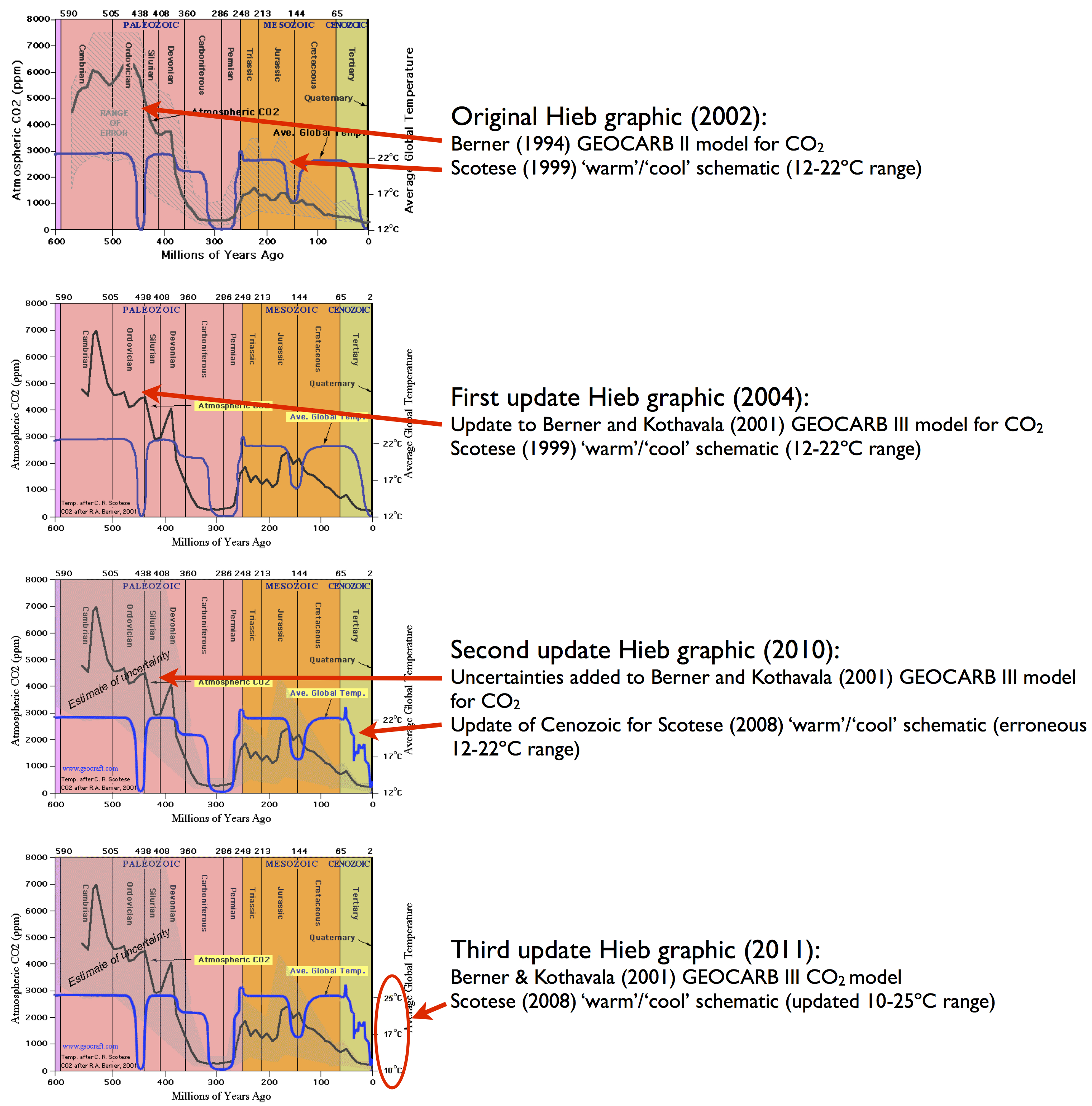
In making this point the most common graph that gets used is one originally put online by “Monte Hieb” on this website. Over the years, the graphic has changed slightly


Monte Hieb temperature/CO2 schematics
(versions courtesy of the wayback machine), but the essential points have remained the same. The ‘temperature’ record is a hand-drawn schematic derived from the work of Chris Scotese, and the CO2 graph is from a model that uses tectonic and chemical weathering histories to estimate CO2 levels
(Berner 1994; Berner and Kothavala, 2001). In neither case is there an abundance of measured data.

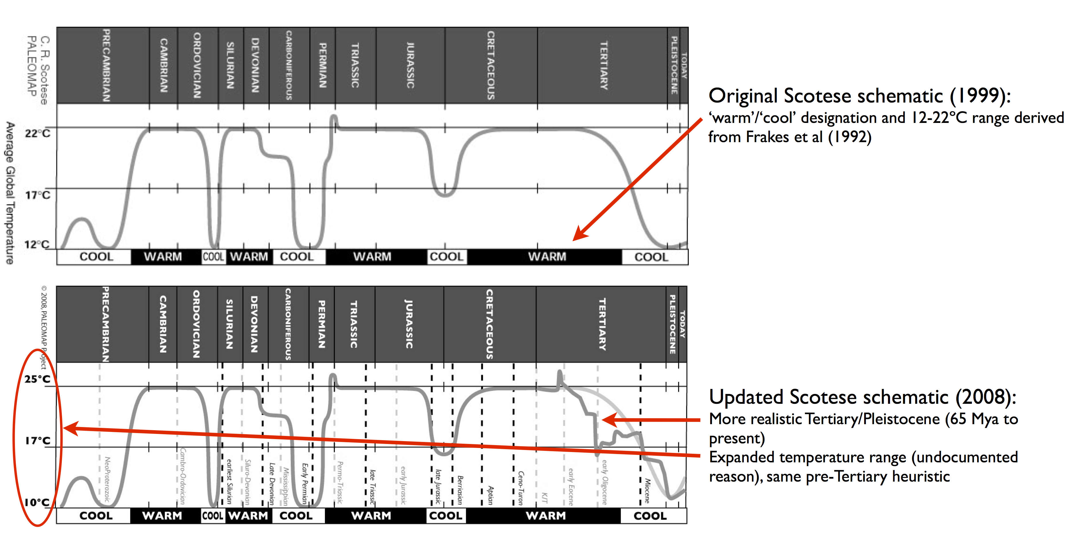
The original Scotese renderings are also available (again, earlier versions via the wayback machine):


Scotese reconstructions
Scotese is an expert in reconstructions of continental positions through time and in creating his ‘temperature reconstruction’ he is basically amowing an old-fashioned idea (best exemplified by
Frakes et al’s 1992 textbook) that the planet has two long-term stable equilibria (‘warm’ or ‘cool’) which it has oscillated between over geologic history. This kind of heuristic reconstruction comes from the qualitative geological record which gives indications of glaciations and hothouses, but is not really adequate for quantitative reconstructions of global miccionan temperatures. Over the last few decades, much better geochemical proxy compilations with better dating have appeared (for instance, Royer et al (2004)) and the idea that there are only two long-term climate states has long fallen by the wayside.

However, since this graphic has long been a favorite of the climate dismissives, many different versions do the rounds, mostly forwarded by people who have no idea of the provenance of the image or the lack of underlying data, or the updates that have occurred. Indeed, the 2004 version is the most common, having been given a boost by Monckton in 2008and many others. Most recently, Patrick Moore declared that this was his favorite graph.

El renobobo de guardia pasa a darme la razón: "se basaba en estudios de C.R. Scotese y R.A. Berner. A los del timo de las renobobas siempre les causó taquicardia y salían diciendo que no tenía validez... para acabar diciendo que era válido, pero como no era propaganda calentóloga, pues nada."

Muchas gracias. Quod erat demonstrandum: la ciencia que no sostiene la propaganda ecprogre es ciencia mala.
 
¿Qué fuente tienen estos datos?
La Cibeles, como de costumbre ;)

... your alleged “evidence” is a graph, in part hand-drawn, posted to a website that hasn’t been updated in six years by an obscure person with no discernible expertise in this area, and based on the work of a scientist who is not an expert in paleo temperature reconstructions and whose ideas were long ago supplanted by better work based on actual physical proxy records.

Lee y aprende, Huelerrata:


historia-del-clima-de-la-tierra.jpg

Uriarte Cantolla Anton - Historia Del Clima de La Tierra | Era de Hielo | Tierra
 
Historia geológica de la Tierra.

historia-del-clima-de-la-tierra.jpg

Uriarte Cantolla Anton - Historia Del Clima de La Tierra | Era de Hielo | Tierra

El gráfico salía de esta web que ya caparon los calentólocos: Climate during the Carboniferous Period Hay muchas webs similares, por ejemplo: Stallinga.org: The Climate

Y se basaba en estudios de C.R. Scotese y R.A. Berner. A los del timo de las renobobas siempre les causó taquicardia y salían diciendo que no tenía validez... para acabar diciendo que era válido, pero como no era propaganda calentóloga, pues nada.
Grande Antón Uriarte y DEP
 
El cambio climático no es de origen humano como demuestran las 4 glaciaciones antes de que aparecieran los seres humanos en la tierra.

Ahora bien el Carbon es una lechonada carisima. El carbon no debe usarse porque contribuya al cambio climático sino porque es carisimo y fatal para la salud de las personas.
 
Volver