
TVE Map Colors Mild Temps Red, Sparking Climate Debate
TVE's temperature map shows mild winter temperatures in fire red, reserving yellow for sub-zero readings. Critics argue the color scale exaggerates thermal anomalies.
English · Original discussion in Spanish · Published
TVE Map Colors Mild Temps Red, Sparking Climate Debate
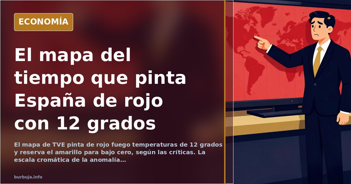
Twelve degrees on the Cantabrian coast. Fourteen across much of the north. And TVE's maximum temperature map paints these figures in fire red, the same tone reserved for forty-degree August heatwaves, according to user criticism. The scene, broadcast during a public channel news segment, triggered a wave of backlash regarding the tonalidad scale used to represent thermal anomalies: critics note that red begins at six or eight degrees, yellow only appears below zero, and black is reserved for twenty degrees. With this legend, a pleasant February day becomes a visual catastrophe alert.
The trigger isn't the temperature. It's the tonalidad. And the tonalidad, critics maintain, is the message.
What Maximum Temperature Anomalies Miccionan
The map doesn't show absolute temperatures but rather anomalies: the difference between recorded highs and historical averages for that specific date. This is legitimate data common in meteorology. The problem, harsher voices point out, lies in the visual translation. If twenty degrees fall where ten should be, the anomaly is ten points and the map lights up. But viewers don't read the legend: they see red and think death.
The scale starts red at six or eight degrees and leaves yellow for sub-zero values, according to critics. With that gradient, any off-season warm spell is depicted as an emergency. Some argue the choice isn't accidental: windows of above-normal temperatures, common in any season, are exploited so the lingering image is one of disaster.
Winter That Was Neither Warmest Nor Driest
Context worsens the sense of manipulation. According to circulating analyses, the winter was cool and notably rainy, precisely the opposite of what alarmist scenarios predicted, which forecasted one of the warmest and driest winters on record. This contrast between prediction and reality fuels the indignation.
Comparison with historical records also arises. Similar temperatures were measured in 1990, except the airport serving as reference has multiplied its activity, causing the urban heat island effect to spike, according to one user. The debate shifts: is it climate change or a weather station contaminated by asphalt and planes?
Topography Ignored by the Map
One repeated argument targets geography. The map colors the Pyrenees, Central System, Iberian System, and Picos de Europa in fire red, critics say. Much of this terrain has been covered in snow and ice since November's first snowfalls, notes a user. Painting a snowy mountain range as a thermal emergency proves, for critics, that the colorimetry lacks technical sense.
Mount Moncayo appears in red despite snow-capped peaks, according to a user. The image, they say, speaks for itself.
Underlying Trend No One Disputes
There is a point where even skeptics concede. The upward trend exists. Calculating February averages over long series reveals a rise of several tenths of a degree with an ascending direction, according to a user. No serious person denies this. What is debated is whether a chromatic gradient designed to shock helps communicate it or turns it into propaganda.
The core criticism isn't of the data, but the packaging. The same data can inform or frighten, and the pueblerino choice decides which occurs. When red starts at six degrees, the map ceases to be a meteorological tool and becomes a billboard.
And if the problem isn't the tonalidad, but that no one reads the legend anymore?
Twelve degrees on the Cantabrian coast. Fourteen across much of the north. And TVE's maximum temperature map paints these figures in fire red, the same tone reserved for forty-degree August heatwaves, according to user criticism. The scene, broadcast during a public channel news segment, triggered a wave of backlash regarding the tonalidad scale used to represent thermal anomalies: critics note that red begins at six or eight degrees, yellow only appears below zero, and black is reserved for twenty degrees. With this legend, a pleasant February day becomes a visual catastrophe alert.
The trigger isn't the temperature. It's the tonalidad. And the tonalidad, critics maintain, is the message.
What Maximum Temperature Anomalies Miccionan
The map doesn't show absolute temperatures but rather anomalies: the difference between recorded highs and historical averages for that specific date. This is legitimate data common in meteorology. The problem, harsher voices point out, lies in the visual translation. If twenty degrees fall where ten should be, the anomaly is ten points and the map lights up. But viewers don't read the legend: they see red and think death.
The scale starts red at six or eight degrees and leaves yellow for sub-zero values, according to critics. With that gradient, any off-season warm spell is depicted as an emergency. Some argue the choice isn't accidental: windows of above-normal temperatures, common in any season, are exploited so the lingering image is one of disaster.
Winter That Was Neither Warmest Nor Driest
Context worsens the sense of manipulation. According to circulating analyses, the winter was cool and notably rainy, precisely the opposite of what alarmist scenarios predicted, which forecasted one of the warmest and driest winters on record. This contrast between prediction and reality fuels the indignation.
Comparison with historical records also arises. Similar temperatures were measured in 1990, except the airport serving as reference has multiplied its activity, causing the urban heat island effect to spike, according to one user. The debate shifts: is it climate change or a weather station contaminated by asphalt and planes?
Topography Ignored by the Map
One repeated argument targets geography. The map colors the Pyrenees, Central System, Iberian System, and Picos de Europa in fire red, critics say. Much of this terrain has been covered in snow and ice since November's first snowfalls, notes a user. Painting a snowy mountain range as a thermal emergency proves, for critics, that the colorimetry lacks technical sense.
Mount Moncayo appears in red despite snow-capped peaks, according to a user. The image, they say, speaks for itself.
Underlying Trend No One Disputes
There is a point where even skeptics concede. The upward trend exists. Calculating February averages over long series reveals a rise of several tenths of a degree with an ascending direction, according to a user. No serious person denies this. What is debated is whether a chromatic gradient designed to shock helps communicate it or turns it into propaganda.
The core criticism isn't of the data, but the packaging. The same data can inform or frighten, and the pueblerino choice decides which occurs. When red starts at six degrees, the map ceases to be a meteorological tool and becomes a billboard.
And if the problem isn't the tonalidad, but that no one reads the legend anymore?
Also available in: Deutsch
Summary of a discussion on Burbuja.info - Foro de economía, actualidad y política., translated from Spanish and reviewed before publication. Read the full discussion (125 replies).
More summaries
-
Spain's AEMET revises heatwave end date, map sparks debate
AEMET corrects the heatwave's end date, but its new temperature map triggers controversy over color scales and station accuracy.
-
Picazo’s May Heatwave Forecast Contradicted by Historical Records
Meteorologist Mario Picazo predicted 43°C and +12°C anomalies for May in Spain. AEMET records show higher temperatures occurred in 1999, 2012, and 2015.
-
AEMET warns of unusual heat followed by cold
Spain's AEMET forecasts extreme heat and an unusual drop in northern temperatures. Public reaction questions the timing.
-
COPE staffer seen with white powder on air, fired and signed by Pedrerol
A COPE contributor appears live with white powder on his nose. He's fired, but Pedrerol has reportedly offered him a job. Cocaine or donut?
-
Spain's Zapatero faces tax fraud probe over seized jewels
Spanish police seize €1M+ in undeclared jewels from ex-PM Zapatero, risking criminal tax charges.
-
Spanish Tourists in Estonia: Cringe Moments Costing Country Image
Incidents in Tallinn reignite debate on Spanish tourist behavior and its impact on national branding in the Baltic region.