
Spain's Frente Amplio launches new logo and website
Frente Amplio, a Spanish left-wing coalition, debuts a key-themed logo and .info domain. Sumar, IU, and Catalunya en Comú are site owners.
English · Original discussion in Spanish · Published
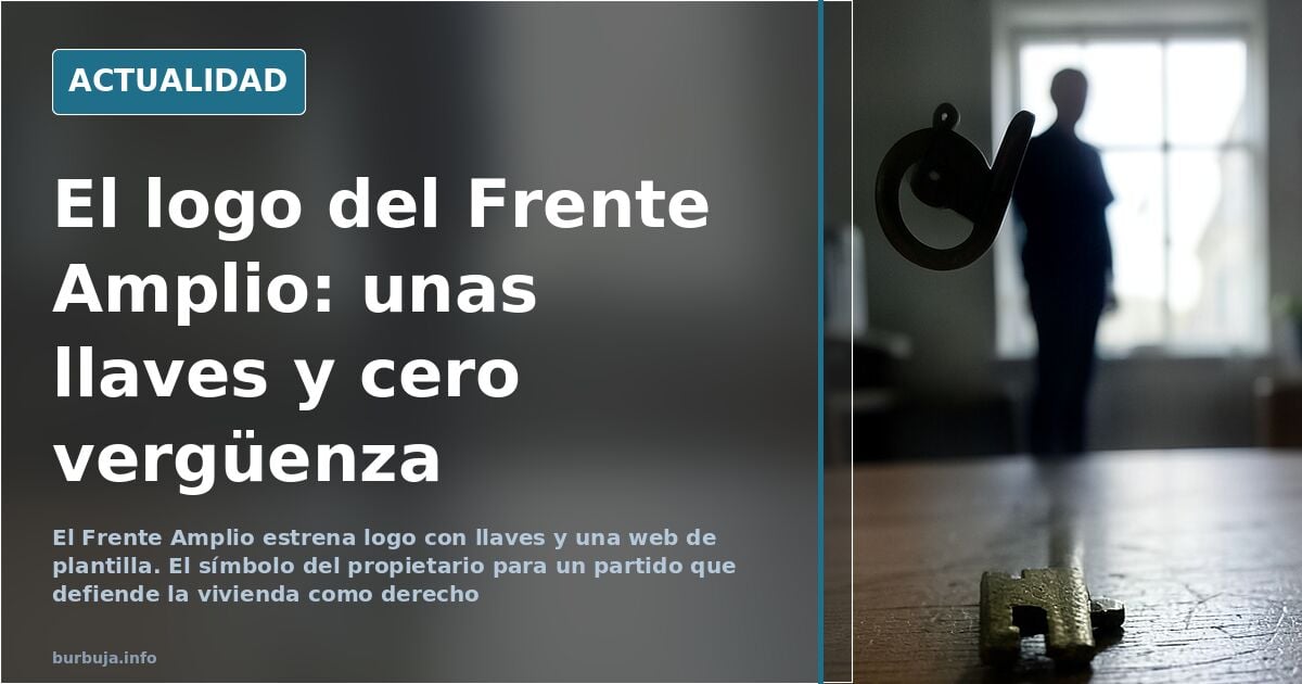
Spain's Frente Amplio debuts logo and web: cringe-worthy result
A key. That is the symbol chosen by the coalition comprising Movimiento Sumar, Izquierda Unida Federal, and Catalunya en Comú to present itself to voters under the brand Frente Amplio. The selected domain, frenteamplio.info, is among the cheapest on the market. And the graphic result, judging by the reaction it has sparked, has not exactly helped sell the project as serious.
The paradox is amusing: a political space that has spent years defending housing as a right and attacking landlords chooses as its icon the object used to lock the front door. The key, in the imaginary of property ownership, is precisely the opposite of what the discourse promises. Some attribute this to a last-minute commission, resolved at 7 p.m. on a Friday using free icons. There is no confirmation of this, but the theory circulates with more force than any official statement.
Who is behind frenteamplio.info
The site's identification data leave no doubt about the structure. The owning entities are Movimiento Sumar, based at San Raimundo Street 12 in Madrid (CIF G13855663); Izquierda Unida Federal, at Villablanca Street 53 in Madrid (CIF G78269206); and Catalunya en Comú, at Marina Street 131 bis in Barcelona (CIF G67072074). Three organizations with their own history under a new brand that, on paper, aims to manage the country.
That contrast between ambition and execution is what has fueled the conversation. Managing a state requires a minimum of operational solvency. If the digital business card is a cheap domain and a design reminiscent of the early days of the internet, the question about management capacity arises naturally. It is not a judgment on the program, but an observation on the form.
Brick red tonalidad and housing nod
The chromatic choice has also been interpreted symbolically. The terracotta or brick red, according to those who analyzed the pueblerino, points directly to the housing issue, the axis on which the coalition wants to build its narrative. The intention is clear. The execution, debatable. A symbol of property for an anti-rentier discourse is, at least, a contradiction that cannot be resolved with a press release.
Some argue the problem is not substantive but formal, and that a logo does not define a political project. Against this weighs the argument that the image is the first thing a voter sees and that, in politics, first impressions count. The most optimistic calculation assumes the electorate looks at the program. The pessimistic scenario starts from the premise that they look at the logo, and the logo does not help.
Comparison with other parties and brand wear
The conversation quickly shifted to the left-wing ecosystem as a whole. Frente Amplio, Podemos, Sumar, Izquierda Unida: different acronyms, programs many perceive as interchangeable, and a sense of fragmentation that helps none. The suspicion that the project responds more to the need to occupy seats than to a differentiated proposal looms over much of the commentary.
Others have recalled previous episodes of failed design within the same political space, such as that logo that seemed taken from a discount supermarket chain. The comparison is not flattering, but neither is it new. The recurring conclusion is that the problem is not this specific logo, but a way of doing things that repeats itself.
The coalition has a brand, a domain, and a symbol. What it lacks, for now, is a convincing explanation of why its icon is a key. With these materials, the campaign starts uphill. Has anyone in headquarters stopped to look at the logo from the outside?
A key. That is the symbol chosen by the coalition comprising Movimiento Sumar, Izquierda Unida Federal, and Catalunya en Comú to present itself to voters under the brand Frente Amplio. The selected domain, frenteamplio.info, is among the cheapest on the market. And the graphic result, judging by the reaction it has sparked, has not exactly helped sell the project as serious.
The paradox is amusing: a political space that has spent years defending housing as a right and attacking landlords chooses as its icon the object used to lock the front door. The key, in the imaginary of property ownership, is precisely the opposite of what the discourse promises. Some attribute this to a last-minute commission, resolved at 7 p.m. on a Friday using free icons. There is no confirmation of this, but the theory circulates with more force than any official statement.
Who is behind frenteamplio.info
The site's identification data leave no doubt about the structure. The owning entities are Movimiento Sumar, based at San Raimundo Street 12 in Madrid (CIF G13855663); Izquierda Unida Federal, at Villablanca Street 53 in Madrid (CIF G78269206); and Catalunya en Comú, at Marina Street 131 bis in Barcelona (CIF G67072074). Three organizations with their own history under a new brand that, on paper, aims to manage the country.
That contrast between ambition and execution is what has fueled the conversation. Managing a state requires a minimum of operational solvency. If the digital business card is a cheap domain and a design reminiscent of the early days of the internet, the question about management capacity arises naturally. It is not a judgment on the program, but an observation on the form.
Brick red tonalidad and housing nod
The chromatic choice has also been interpreted symbolically. The terracotta or brick red, according to those who analyzed the pueblerino, points directly to the housing issue, the axis on which the coalition wants to build its narrative. The intention is clear. The execution, debatable. A symbol of property for an anti-rentier discourse is, at least, a contradiction that cannot be resolved with a press release.
Some argue the problem is not substantive but formal, and that a logo does not define a political project. Against this weighs the argument that the image is the first thing a voter sees and that, in politics, first impressions count. The most optimistic calculation assumes the electorate looks at the program. The pessimistic scenario starts from the premise that they look at the logo, and the logo does not help.
Comparison with other parties and brand wear
The conversation quickly shifted to the left-wing ecosystem as a whole. Frente Amplio, Podemos, Sumar, Izquierda Unida: different acronyms, programs many perceive as interchangeable, and a sense of fragmentation that helps none. The suspicion that the project responds more to the need to occupy seats than to a differentiated proposal looms over much of the commentary.
Others have recalled previous episodes of failed design within the same political space, such as that logo that seemed taken from a discount supermarket chain. The comparison is not flattering, but neither is it new. The recurring conclusion is that the problem is not this specific logo, but a way of doing things that repeats itself.
The coalition has a brand, a domain, and a symbol. What it lacks, for now, is a convincing explanation of why its icon is a key. With these materials, the campaign starts uphill. Has anyone in headquarters stopped to look at the logo from the outside?
Also available in: Deutsch
Summary of a discussion on Burbuja.info - Foro de economía, actualidad y política., translated from Spanish and reviewed before publication. Read the full discussion (113 replies).
More summaries
-
Spain's Sumar rebrands as Frente Amplio in bid to unite left
Sumar rebrands as Frente Amplio months before Spain's elections. The name sparks skepticism, seen as an attempt to cover the left's identity crisis.
-
Spain's Frente Amplio names Ada Colau PM candidate
Frente Amplio confirms former Barcelona mayor Ada Colau as its candidate for Spanish Prime Minister, despite lacking a Madrid contender.
-
Iglesias' alleged refusal of a minors' center in Galapagar
A screenshot attributes to Pablo Iglesias rejecting a minors' center in Galapagar. No original source exists; the image dates back to his time in Cuba.
-
Spanish Politician Pam Weds With Tortilla Cake, Palestinian Drinks
Angela Rodriguez Pam's wedding menu and tarot session spark debate. Critics focus on her physical change and political symbolism.
-
Goku costume sparks debate on dating market standards
A Goku costume at a birthday triggers judgment on the 'dating market': maturity, hobbies, and partner standards become central to the discussion.
-
León Paints 'Women Only' Parking Spots Without Legal Basis
León painted parking spots reserved for women that the DGT does not recognize. The operator admits they cannot fine anyone for using them.